Posts

Tufte - Escaping Flatland

Ever since I started to appreciate art and fell in love with it, what annoyed me though was how to read more dimensions in my drawings and paintings. I love creating images but it always frustrated me on how to make my designs more appealing and draw the viewer in. As I grew older and learned more techniques on how to create an image with more dimensions my frustrations slowly started to disappear because now I could truly appreciate the hard work that goes into making a picture. Drawing on a two dimensional flatland is hard and it not easy to turn it into a three dimensional piece. Detail, percision and accuracy are just some of the ways into making sure a three dimensional image is created. What I found to be interesting from reading the article is that a three dimensional image can be so different from the actual image. Not every detail can always be attained when working on a two dimensional flatland and limited space. Many techniques have been used throughput time to create thre...

Post Modern Mix Media Phase Two

The following work of art I did centers around a picture portraying images of technology. I chose to put together different pictures of technology that most people could identify and easily pick out. The picture goes along with the quote I chose from phase one of this project, "We live in a world where there is more and more information, and less and less meaning." (Jean Baudrillard) The following quote stuck out to me because it is true, we do depend so much on technology and information now has little meaning because we don't have to remember it we can just look it up on the internet. The denotative aspect of my art piece is that the viewer is looking at somewhat dark, giant clouds of blues, dark blues, purple's, dark pink and black. I chose this color scheme of analogous because the picture in the center has similar colors and I wanted the viewer to look at the picture as if the colors were swirling out of my technology picture. The Connotative aspect of the ima...

Postmodernism Introduction Reading

After reading the Postmodernism article, I was confused because I did not first understand what the article was about, I knew it had to deal with postmodernism artists but I felt like I had to re read it in order to truly understand in what I thought the article meant. After re reading the article five times I came to the conclusion and found postmodernism to be very interesting and how it compared postmodern artists to explorers. I found this to be interesting because postmodern artists are trying to create what they see around them and what is new and changing and what is in and what is out. They are creating new symbols, and messages in order to keep up with the changing times and which best represents reflects the surroundings around them and what people want to see or here.  But I questioned should artists keep up with the postmodern world and not create the past in order for others to view past history and instead create new history? Should postmo...

Podcast- Colors

After listening to the following podcast “Colors,” I found it very interesting as it opened up many ideas and questions I had never even thought about that had to deal with color. I think its so interesting that everything we see is color and we associate objects with color. For example, when talking about the sky we always assume it is blue and when talking about grass we always assume it is green.  What gets me though is that not everyone see’s the same colors as most people. Instead there are some people who have color blindness, which makes people see different colors then what the actual color of the object is. Too me it has always fascinated me because I never thought to think that not everyone sees’ the grass green or the sky blue.  Another thing that really gets me and had me thinking about the fascination of how people perceive certain objects and there colors is that some people have the ability to see a person and associate them ...

White Pictures

Image
In the first picture the white bracelet becomes more of a grey tint against the white folder. In the second picture the white headphones also have a hint of grey as well as parts of the folder have hint of grey and bluish tones.

Subvertisement Project

Image
Before Alteration  After Alteration 

BMA

Image
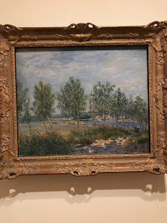
Photos ranked 1 to 3 1.)  Alfred Sisley French 1839-1899 Poplars on a River Bank 1882 Oil on a canvas Composition- Golden Triangle, L-Shapes, and Leading Lines Poplars on a River Bank just seemed really calm and tranquil, with the leaves and grass slightly blowing in the wind and the water in the background. This painting made me feel as if I was standing under one of those trees with the breeze swaying back and forth gazing out to the stream. 2.) Henri Matisse French, 1869-1954 Girl Reading, Vase of Flowers 1922 Oil on canvas Composition- Golden Triangle and L-Shapes Henri Matisse often incorporated flowers in vases in his paintings contrasting patterns which were always in perfect union of lines and colors. The vase of flowers pop out of the painting and immediately your eye is drawn to it, as the women sitting in the chair is set back and seen as second compared to the flowers. The women in the chair seems rather sad as her arm is holding ...